Revamping Sharpie’s Global eCommerce
The Backstory
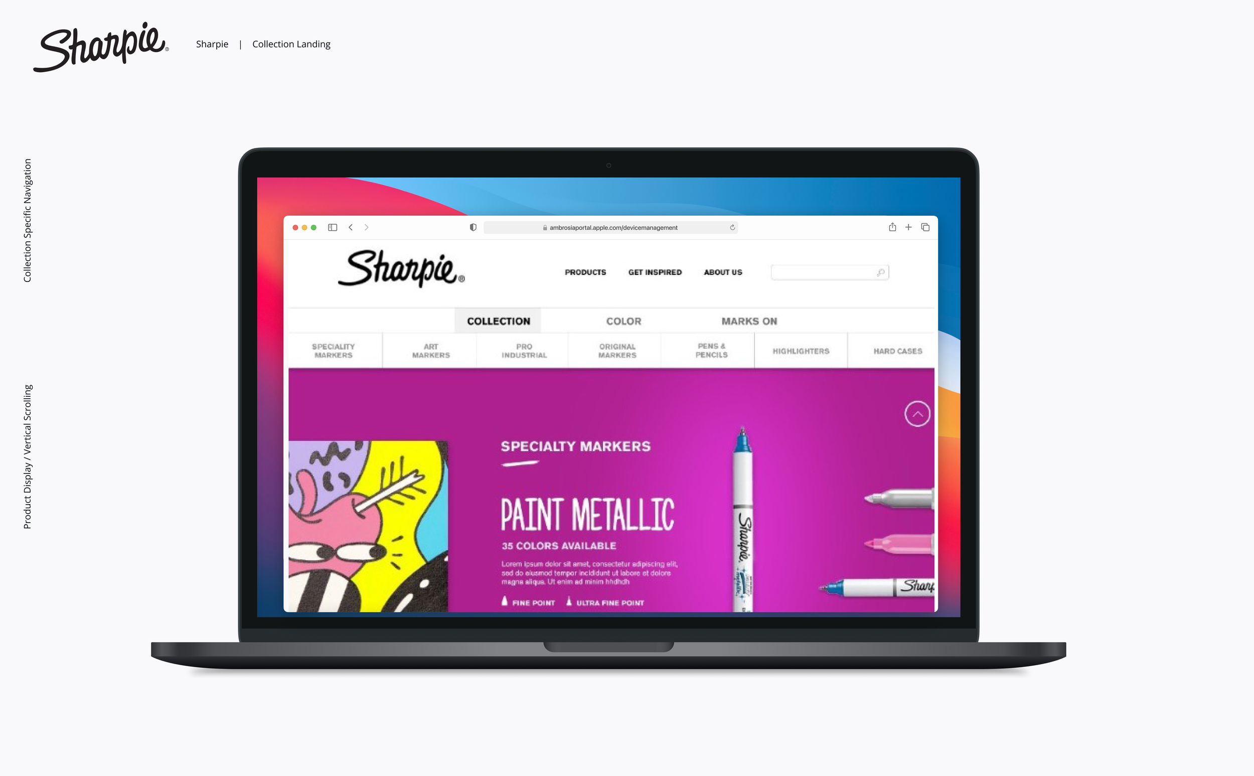
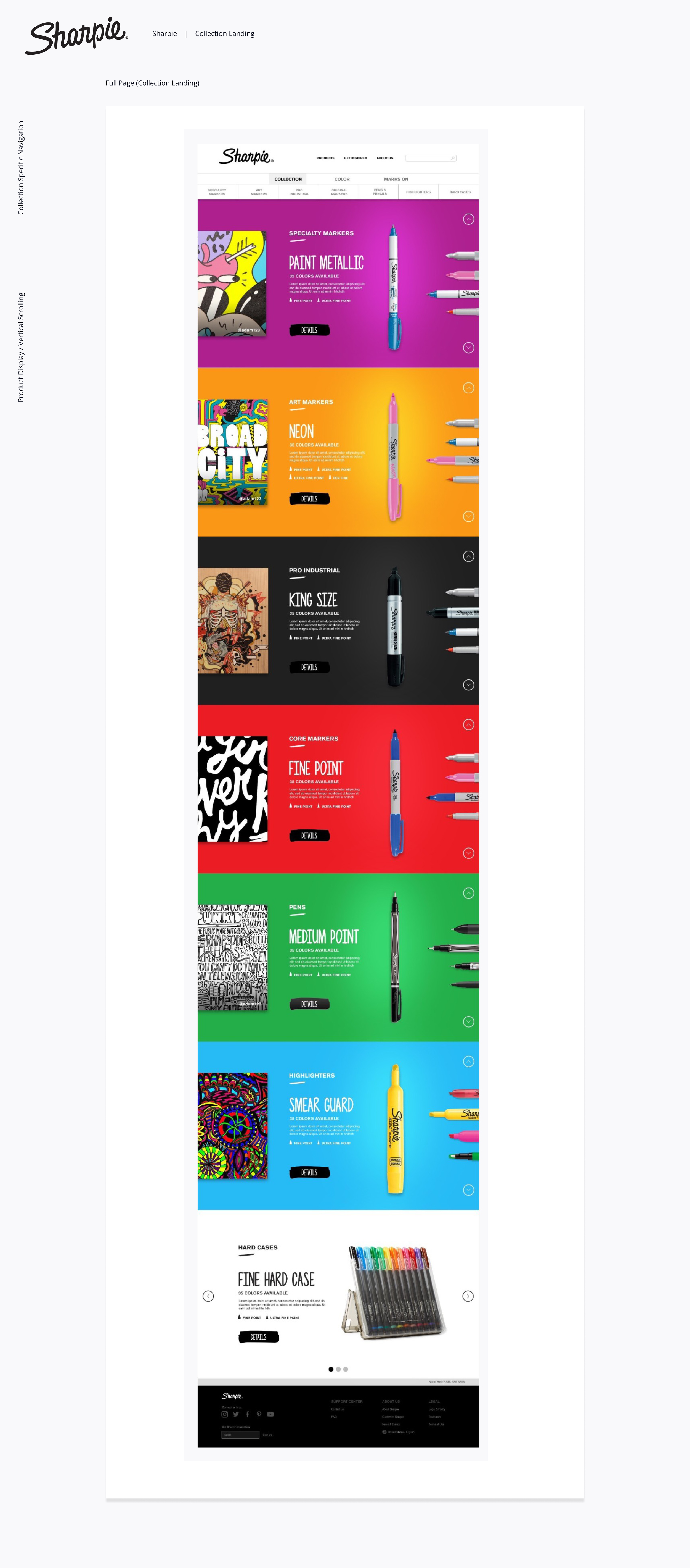
Sharpie is far more than a permanent marker—it’s a symbol of bold, fearless, and unique self-expression. Designed to stand out on any surface, Sharpie empowers individuals to make their mark in unforgettable ways. The redesign of Sharpie.com aimed to encapsulate this spirit, creating a digital presence as vibrant and creative as the brand itself.
The Challenge
The primary challenge was to reimagine Sharpie.com to be more fun, playful, and engaging while staying true to its brand ethos. This required striking a balance between creative storytelling and functional usability to inspire users and drive conversions.
Key obstacles included:
Establishing a visually dynamic yet user-friendly design.
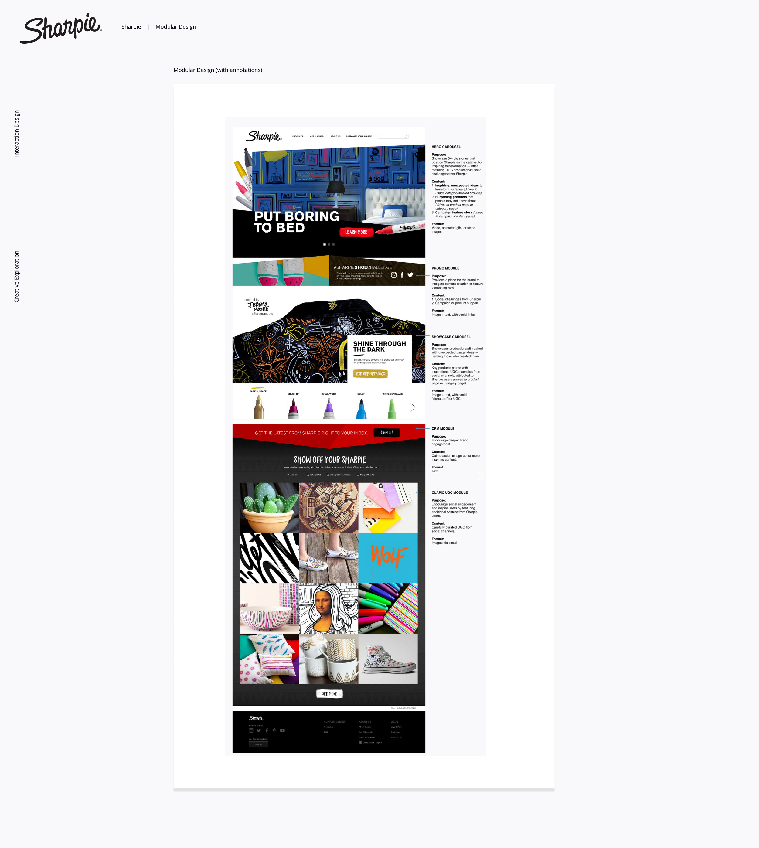
Developing interactive elements that showcased Sharpie’s versatility and creative potential.
Validating new design concepts to ensure alignment with user expectations and business goals.
My Role & Contributions
As the Lead Designer, I spearheaded the transformation of Sharpie.com through innovative design strategies and user-centered methodologies:
Creative Ideation: Developed concepts that infused the site with Sharpie’s playful and bold character, using dynamic visuals, vibrant colors, and interactive elements to captivate users.
Validation Research: Conducted user research and testing to validate design decisions, ensuring they resonated with Sharpie’s diverse audience while meeting business objectives.
Revenue Impact: By aligning the redesign with user needs, the new Sharpie.com contributed to a 25% increase in revenue, driven by improved engagement and streamlined pathways to purchase.
Cross-Functional Collaboration: Partnered with marketing, engineering, and stakeholder teams to ensure a cohesive brand narrative and seamless execution of the redesign.
The Solution
* Click thumbnails below to view samples in full view